UI Node
Overview
The UI node is a flow control node that pauses an iteration and presents an interactive form to the user. Execution continues after the user submits the form.
The form can include fields from downstream nodes, workflow properties, and action buttons such as Download or Launch. Submitted values can update properties that downstream nodes use.
Purpose
Use this node when a workflow needs a human-in-the-loop step, such as confirming values, collecting report parameters, allowing a user to download or launch generated output, or overriding properties before the next node runs.
Configuration
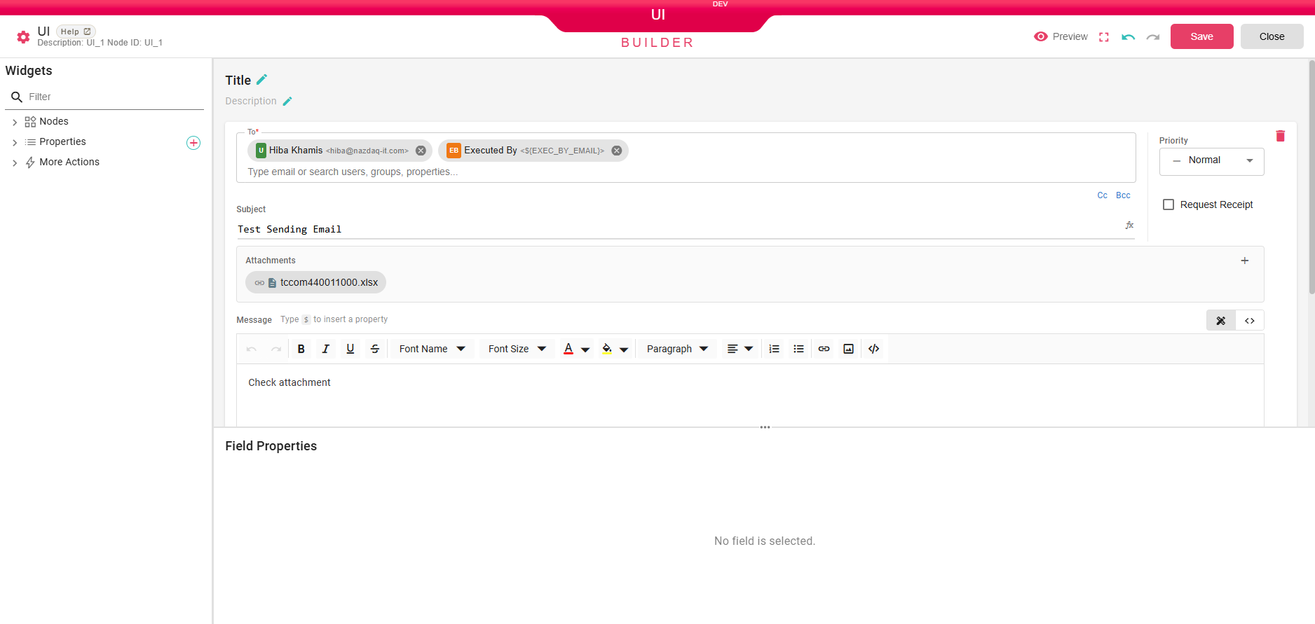
Opening the node launches the UI Builder, a custom full-screen editor with a Widgets panel on the left and a form canvas in the center.
Title and Description
At the top of the canvas you can set a Title and a Description for the form. Click the pencil icon next to each to edit the text. These are displayed to the user when the workflow pauses.
Preview
At the top-right you can click on Preview to open a preview of the form as the user will see it.
Save Defaults
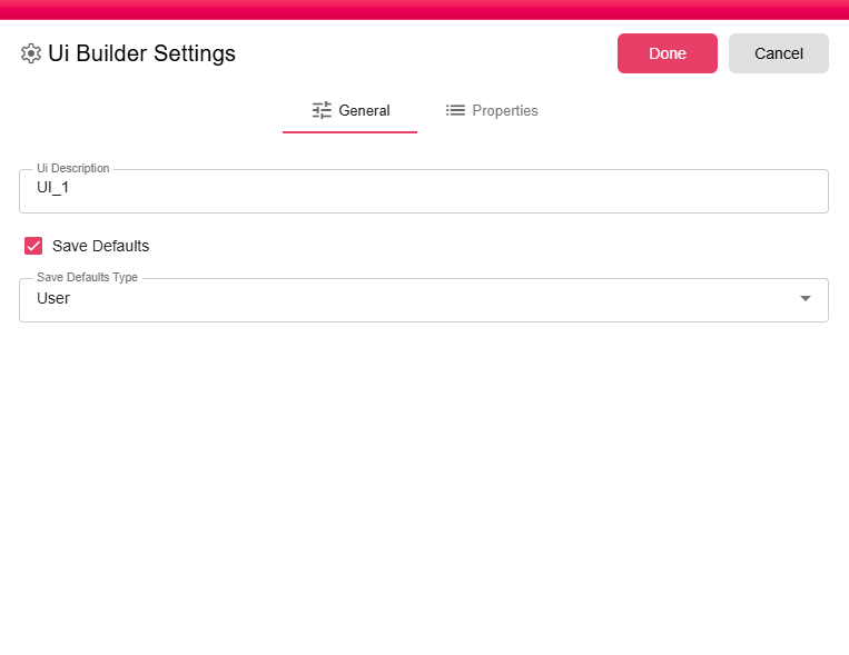
Click the gear icon to open UI Builder Settings. Here you can enable Save Defaults.
When enabled, end users can save their current form inputs as defaults by clicking Save defaults, or clear them by clicking Reset defaults. The next time the form opens for the same defaults scope, saved values are preloaded and the UI displays My defaults were loaded.

Save Defaults supports these scopes:
- Check the Save Defaults box.
- Select a Save Defaults Type:
- User - Saves defaults per user. This is useful for shared workflows where each user should see only their own saved values.
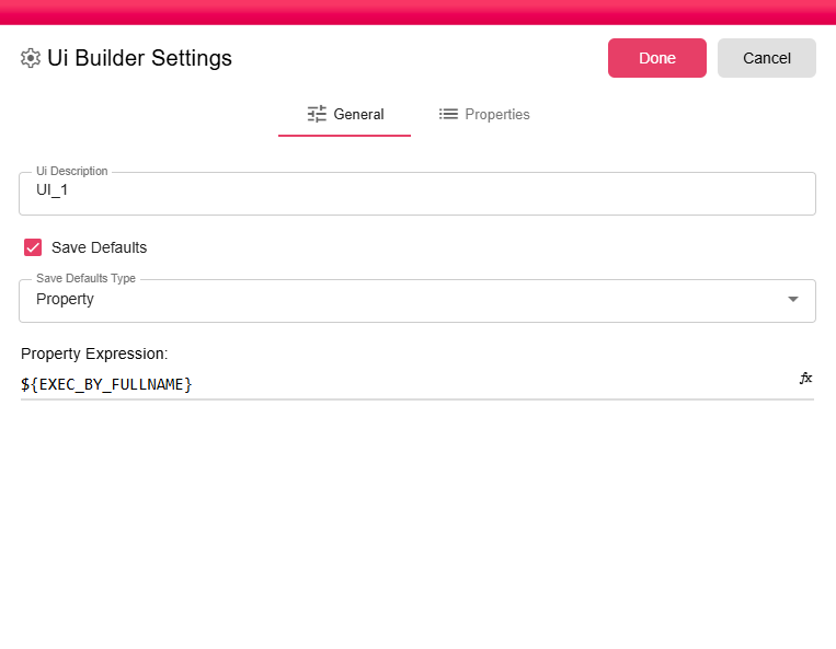
- Property - Saves defaults under a dynamic property expression, such as
${REPORT_TYPE}. The property expression is required when this type is selected.
Widgets Panel
The left panel lists all available widgets grouped into categories. Use the Filter box at the top to search by name.
Nodes
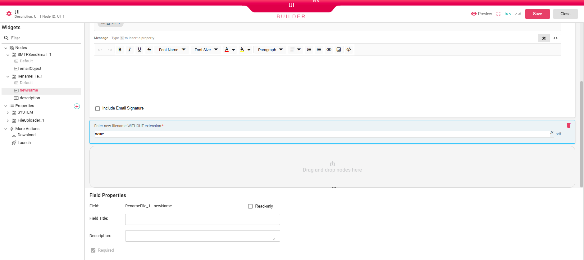
Expands to show every node that is downstream of the UI node in the workflow. Each node can be further expanded to reveal its individual configurable fields. For example, an SMTPSendEmail node exposes fields such as emailObject (the full email composition form), and a RenameFile node exposes fields such as newName and description.
Drag any field from the Nodes section onto the canvas to include it in the user form.
Properties
Lists custom workflow properties and system-level properties. Click the + button to add a new property. Drag any property onto the canvas to let the user set its value at runtime.
More Actions
Contains action widgets that can be added to the form:
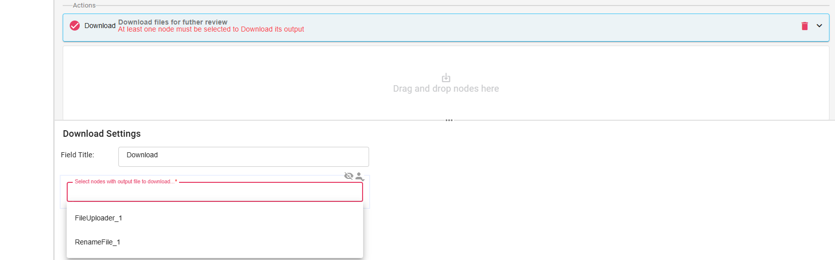
- Download - Adds a Download button to the form. When a node is associated with it, the user can download that node's output directly from the form.
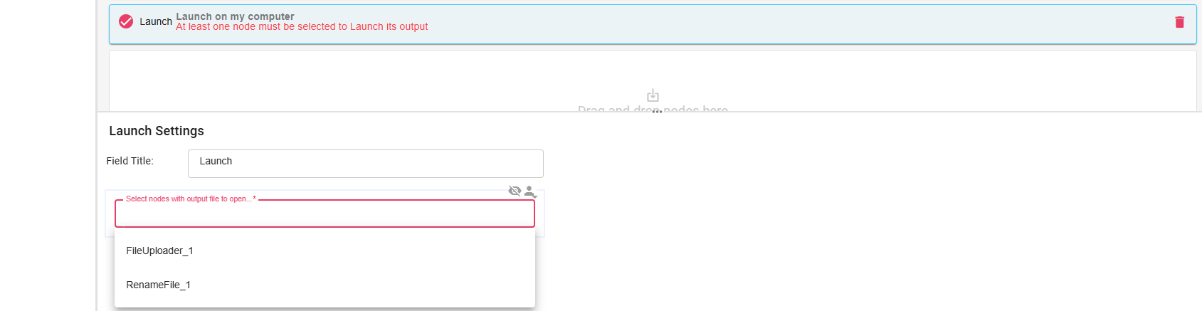
- Launch - Adds a Launch button to the form. When a node is associated with it, the user can open that node's output via a browser or via the B2Win Suite Desktop Client if the client is connected.
Building the Form
Drag widgets from the left panel and drop them onto the canvas drop zone. Each dropped widget renders as an interactive control exactly as it will appear to the user.
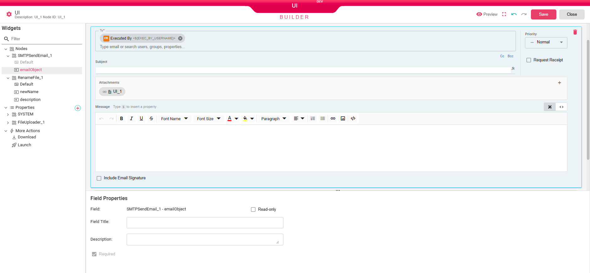
In the example below, the emailObject field from SMTPSendEmail_1 has been dragged onto the canvas, rendering a full email composition form, and the newName field from RenameFile_1 has been added below it as a text input:
Field Properties
When you click on a widget in the canvas, the Field Properties panel appears at the bottom of the screen. It lets you customize how that field is presented to the user:
- Field - The internal identifier of the field (read-only).
- Read-only - Displays the field but prevents editing.
- Field Title - Optional label shown above the field instead of the default field name.
- Description - Optional helper text displayed below the field.
- Required - Requires the user to fill in the field before resuming the workflow. Fields required by the underlying node are automatically required here.
Action Settings
Drag Download or Launch from More Actions to add action buttons to the form. Each action requires at least one node to be associated with it so it knows which output to act on. Select the action widget in the canvas and a Download/Launch Settings section will appear below where you can choose the node(s).
Inputs
| Input | Data Type | Input Type | Description |
|---|---|---|---|
| Input | Any | Single | Any Input |
Outputs
| Output | Data Type | Collection | Description |
|---|---|---|---|
| Output | Any | False | Any Output |
Processing Logic
- The node receives an input.
- On the first pass, it evaluates the configured title, description, and widget values that contain expressions.
- It stores the UI configuration on the current data item and marks the iteration as pending.
- The user opens and submits the form from the UI viewer.
- On resume, submitted property widgets are applied to the current data properties.
- The node sends the input to the
Outputport.
If execution is run only until the UI node, the node preserves the form data and remains pending instead of continuing.
Examples
Property Type Save Defaults
Instead of saving defaults per user, Property defaults let the workflow save different defaults based on context.
For example, suppose your workflow generates either a summary or detailed report based on a ${REPORT_TYPE} property:
- Enable Save Defaults and set Save Defaults Type to Property.
- Use
${REPORT_TYPE}as the property expression. - Run the workflow when
${REPORT_TYPE}isSummary, fill out the form, and click Save defaults. - Run the workflow when
${REPORT_TYPE}isDetailed, fill out different values, and click Save defaults again.
Future runs load the saved values for the current ${REPORT_TYPE} value. If the expression evaluates to a new value that has no saved defaults, the form starts without saved values.
Notes / Limitations
- The form can expose widgets from downstream nodes, properties, and action widgets.
- Runtime expressions in widget values are evaluated before the form is shown when possible. If an expression depends on a value that is not available yet, it may be left for the destination node to evaluate.
- Property widgets can override output properties after the form is submitted.
End User Experience
To see what the end user experiences when the workflow reaches a UI node, refer to UI Node Viewer. This is what appears for the user when running the workflow inside Library.